The cover of a print book has three parts: the front cover, the spine and the back cover. These three components are printed together as a large rectangle that wraps around the pages to create the finished book. When it’s laid out flat, a print cover looks like this:
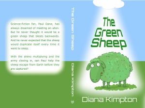
The front cover
This is what most people think of when we talk about book covers. It’s the part of the print book that shows when it’s placed face out in a book shop, and it’s the part that shows when the book is listed in an online bookshop. You can find out more about designing the front cover in our article on the basics of cover design.
The front cover of the print book is usually the same as the ebook cover. However, if you’ve already created an ebook cover with a photo or other picture running right up to the left hand edge you will need to change it a little for the print edition. This is because, with Print on Demand, there is a slight variation in the position of the folds either side of the spine so there is a risk that the picture may wrap around onto the spine or end slightly short.
Solving this problem doesn’t need a complete redesign. If you think carefully, you’ll probably be able to sort it out with a minor tweak.
The spine
The size of the spine is is determined by the number of pages in your book, and your POD company will tell you how big it should be. They’ll also tell you how much variation to allow for and supply you with a template to help you make sure your cover is exactly the right size.
Place the text on your spine in the centre with enough space to the left and right to allow for the variation in fold position. By convention, the text should be set so it can be read from left to right if you lie the book down on its back cover. (Look at the books on your bookcase to see what I mean.) Although there is nothing to stop you setting the text some other way, it will make your book look strange or amateur which is something you should try to avoid.
Make sure the writing on the spine is easy to read as that’s all that will be visible if you are lucky enough to get your book onto o shelf in a bookshop. (This is something else I learned the hard way.) Choose a colour that contrasts strongly with the background and avoid fancy fonts. You don’t have to use the same font and colour as the front cover – once the cover is folded around the book no one is going to see them side by side.
Unfortunately, you can’t put text on the spine of a very slim book (such as a picture book) if you are using Print on Demand. This is another problem caused by the variation in the position of the spine, and I haven’t found a way around it.
The logo
Traditional publishers put their logo at the base of the spine. This isn’t compulsory but it looks professional so you may feel it’s worth the effort to create your own logo. Keep the design clear and simple and, if you’re tempted to use clip art, check the licence first to make sure it doesn’t exclude use in logos.
The back cover
Readers expect the back cover to contain a description of the book. If you wish, you can also include extracts from reviews and/or a bit about yourself, but neither are essential. The author information is more relevant for a non-fiction book, where readers may want to know if you are an expert in the subject.
You can make the back cover more appealing by putting the text in a shaped box or by adding some relevant artwork, as I’ve done here with this picture of a horse jumping over the words.
It looks best not to have the text run the full width of the back cover, but don’t use the centre command to bring the text into the middle as that will produce ragged edges which make reading difficult. It looks neater if you increase the margins to bring the text in from the edges of the back cover or use a text box to do the same.
The barcode
An important part of the back cover is the bar code. Createspace adds this to the cover for you so you just need to leave enough space for it (as I have done on both covers in this post). Ingram Spark asks you to include the bar code in your cover design yourself but they create it for you as part of the cover template. There are also various websites that offer to help you make the bar code but, in my experience, the result isn’t always high enough resolution to print properly.
Gloss or matte
When you set up your book for POD, you’ll be given the choice of having a gloss or a matte cover. Some people think matte covers look more professional, but there are plenty of traditionally published books with gloss covers so it’s really a matter of personal preference. After experimenting a bit, I’ve decided that I prefer gloss for my books as the colours are more vibrant. However, you may feel differently, especially if you are writing for a niche where matte covers are the norm, and, because you are the publisher, the decision is yours.
Diana Kimpton
Comments are closed.