When I first decided to do a print edition of There Must Be Horses, I intended to pay someone to lay out the book for me. But most designers use Adobe Indesign so I wouldn’t be able to make any last minute edits myself unless I bought the same software. At £650, that was seriously expensive and way outside my budget.
Thankfully an internet search showed up a viable alternative that was much, much cheaper: Serif Page Plus. At around the same time, I met an author at the Winchester Writers’ Conference who had used PagePlus to create his book. The end result looked so professional that I decided to give the software a try, and I’m really glad I did. (I used PagePlusX6 but this has now been replaced by PagePlusX7.)
Tackling a task I had never done before with software I had never used was a pretty ambitious project involving a huge learning curve. I initially felt very daunted, but I soon found there is plenty of useful information on the web as well as Serif’s own tutorials. There’s even a phone helpline where an extremely helpful man patiently talked me through something I was finding extra tricky. Once I’d learned how to use master pages for internal design and layers for cover design, I was able to experiment and discover the full power of this excellent software package.
Page Plus produces high quality pdf files ready for sending to the printer. But before I was ready to do that, I needed to understand the conventions of book layout and learn how to make professional decisions about fonts. For this, I turned to several other resources.
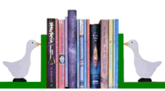
- The books on my bookshelves.
Looking at these helped me see that the odd numbered pages are always on the right and that new chapters start further down the page than the rest of the book does. They showed me the most common size for books like mine, the usual number of lines per page and the way copyright information is usually laid out. - www.thebookdesigner.com
An excellent site full of advice on book layout and cover design. - Createspace
Amazon’s user friendly POD system offers helpful advice and templates to help you lay out your book. I found its article on creating pdf files particularly useful. - www.fontsquirrel.com
A useful source of free fonts. - The Non-Designer’s Design and Type Books
I love this book by Robin Williams (which is actually two books in one). It’s an excellent introduction to design and type for beginners, packed full of visual examples that demonstrate the difference even small changes in layout can make. I found it invaluable for understanding which fonts to choose and how to decide about leading (the technical term for line spacing). It’s also useful for designing information sheets, bookmarks and other publicity material.
Many people have commented that the print edition of There Must Be Horses looks very professional so these resources worked for me. Why not give them a try?
Diana Kimpton
